
How to Add Powerful Tables and Graphs to Your Substack Posts
Data Visualization for your Substack Posts.

I’m working on a new post for you where I asked nine AI power users a set of questions. While preparing it, I ran into a small but annoying obstacle: Substack’s editor doesn’t support tables. And honestly, it makes sense, tables break layouts, require special formatting, and can get messy with different screens.
But I found a great workaround: Datawrapper. It has a generous free plan, and it works beautifully with Substack.
This is how it works
Here’s the basic process:
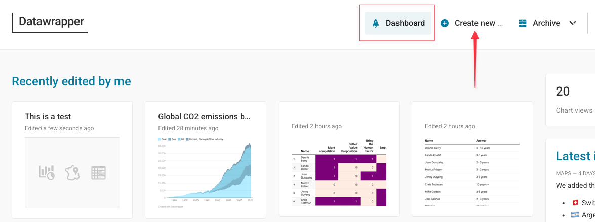
Create a free account
Copy and paste your data from a spreadsheet into Datawrapper
Adjust the layout or style if needed
Publish
Copy the link and paste it directly into your Substack post
The result? A fully interactive table (not an image!) that your readers can scroll through, even sideways.
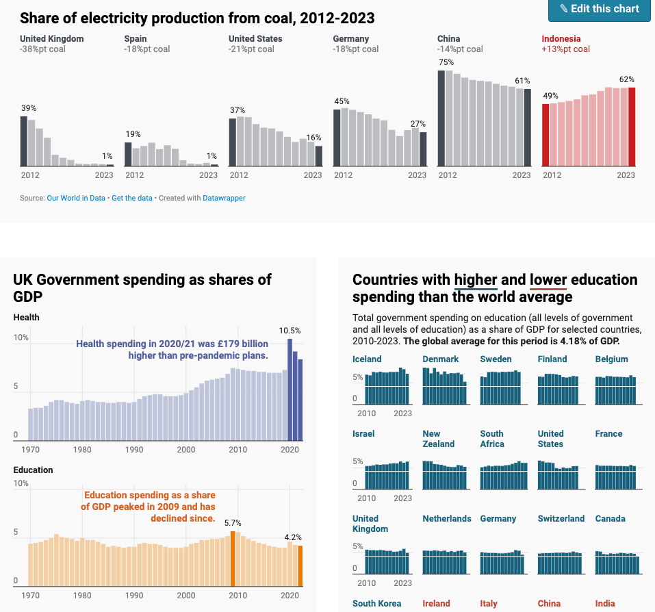
And here’s a short demo
One important note:
Once you publish a chart/table, it shows up in your Dashboard, so the link always stays connected to the real data—no need to re-upload or replace anything.
Wrapping up
If you paid close attention, you may have already spotted the answer to one of the questions from my nine AI power users. The full report is coming any day now, so stay tuned.
If you try Datawrapper and like it, let me know.
And if you’re already using it, I’d love to hear how — feel free to share your examples or use cases in the comments.
Have a great week,
Jose from Automato.

Last week I was searching for a tool like this...
Thanks for sharing. I will check this.
Interesting to see what AI apps the authors are using! 🌟